PFF, LLC is a consulting firm that develops tools to help nonprofits, local governments, and small agencies manage their budgeting more effectively.
For their emergency management clients, we redesigned InCEP, a legacy budget planning platform, into Treasora, an AI-assisted system that streamlines how mission assignments, cost estimates, and transactions move through a multi-role approval chain.
~ 10%
error rate across core workflows, as seen from 7 usability tests
High AI adoption
Users actively relied on AI for cost estimation and decision support
Imagine you're a financial analyst during a hurricane response. You need to create a Mission Assignment so emergency work can begin fast…
InCEP Platform

Manual data entry slows workflows

Error prone submissions

No visibility into approval status
Instead, you're stuck in InCEP
Product Highlights

Instead of manually transcribing every field, the analyst uploads the source document and reviews what the system extracts.

Funding line amounts are suggested from comparable past mission assignments.
AI generates a findings summary ranking every issue by severity.
Object class codes come from a fixed federal list, so coding is a matching problem.
From static dashboards to conversational business intelligence.
RESEARCH
—
Changing a legacy system is never easy.
Competitor Analysis
Some insights include:
There is an opportunity to eliminate the manual burden of the legacy InCEP platform rather than simply adding an AI layer on top.
If the tool requires extensive training, it will face adoption resistance.
The strongest dashboard patterns share top-level KPIs at a glance with drill-down detail below.
Mapping InCEP Workflows
Some insights include:
Emergency financial workflows are structured around three core entities: Mission Assignment (MA), Cost Estimate (CE), and Transaction.
Cost estimates define how funding is allocated and must be approved before any spending can occur.
Approval is embedded throughout the workflow, governing both funding decisions and actual spending.
Understanding User Needs
Financial Analyst

Requestor

Approver

Director

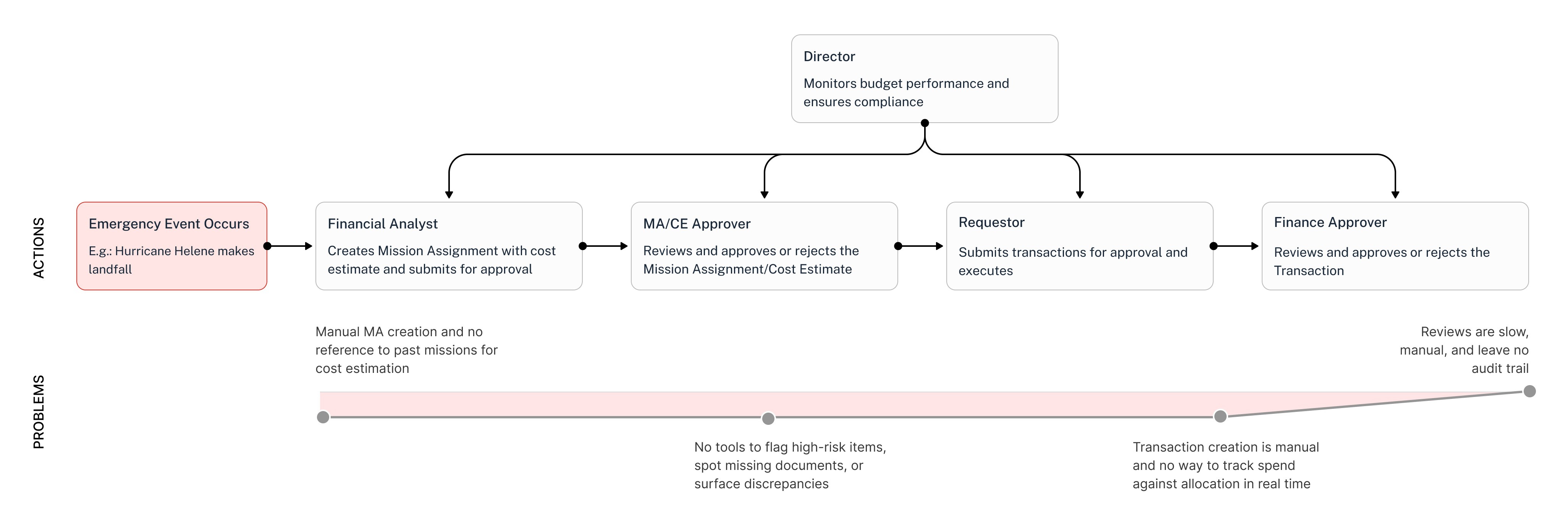
Organizational Workflow
The current platform treats a multi-role, time-sensitive workflow like a series of isolated forms with no intelligence, visibility, or continuity between steps.
IDEATE
—
How Might We

Faster Creation
How might we help financial analysts create mission assignments and estimate costs without manual data entry?

Informed Purchasing
How might we help requestors track spend against allocation before committing to a purchase?

Confident Approvals
How might we help approvers surface discrepancies and make confident decisions without line-by-line review?

Real-Time Oversight
How might we give directors real-time visibility into budget utilization across all mission assignments?
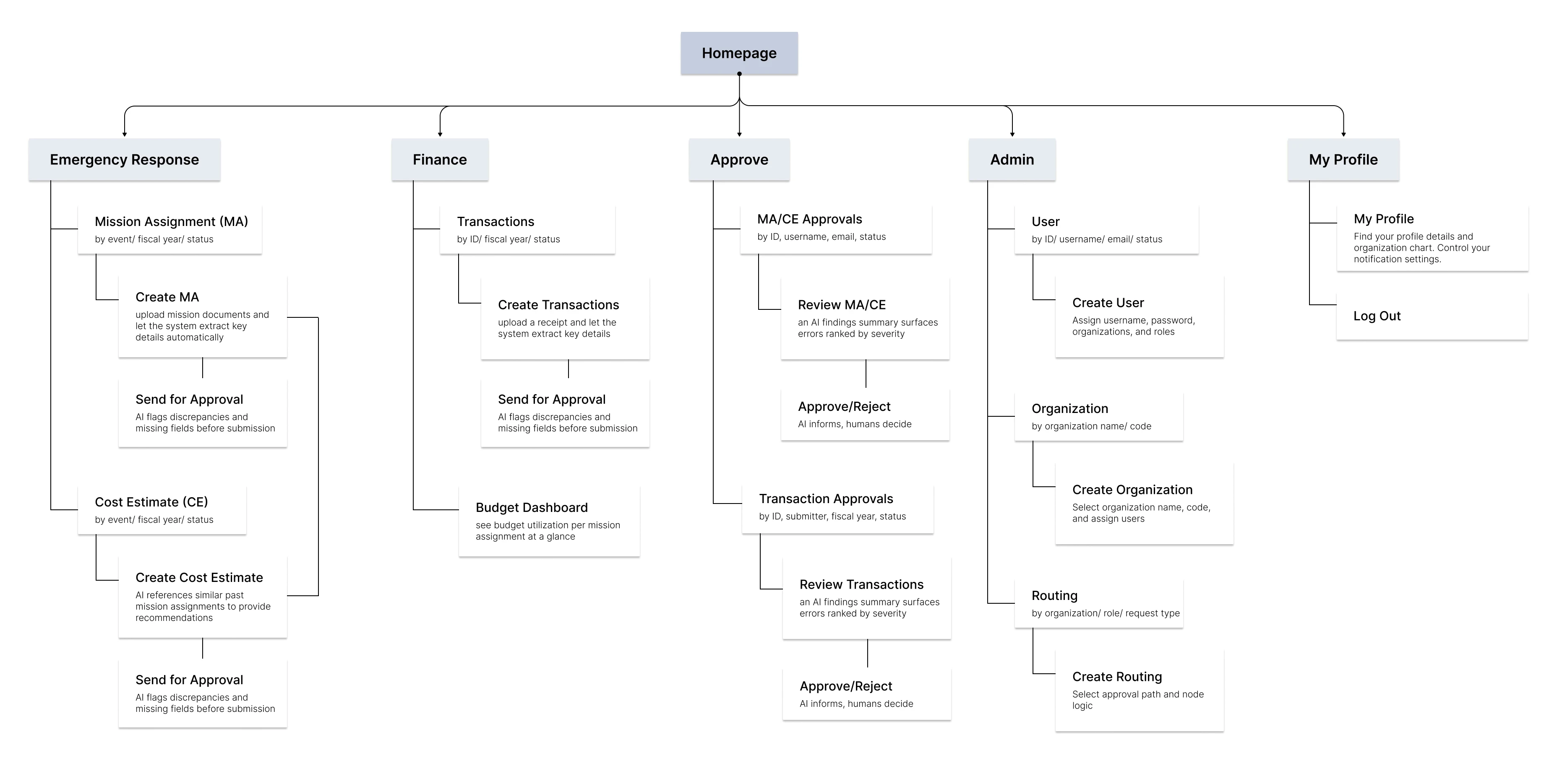
Information Architecture
Then, we finalized the creation of an information architecture for the product, with core workflows such as Emergency Response, Finance, Approve, Admin, and My Profile.
Design Decisions
Core Principle 1: AI informs, humans decide

AI suggests a cost estimate based on past mission assignments

Intelligent funding line suggestions from expense descriptions
Similarly, AI recommends funding lines based on expense descriptions but never fills them out for the user.
Core Principle 2: Every decision leaves a trace via audit defensibility

Define the approval chain once, enforce on every request
Admins compose the approval sequence as a reusable rule - roles, order, and parallel reviewers - so routing is a configuration decision, not a per-request judgment call.

Who approved what, when, and why, on the record itself
Every state change is attributable to a named person and timestamp, with reviewer comments inline. The audit trail lives in the workflow, not in an export.
PROTOTYPE
—
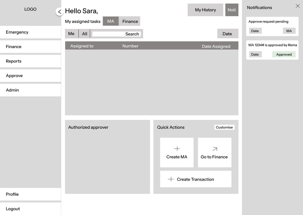
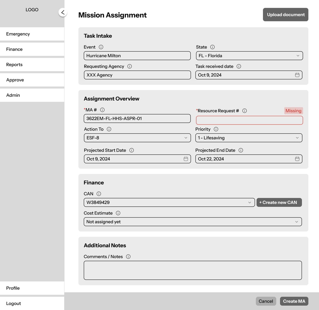
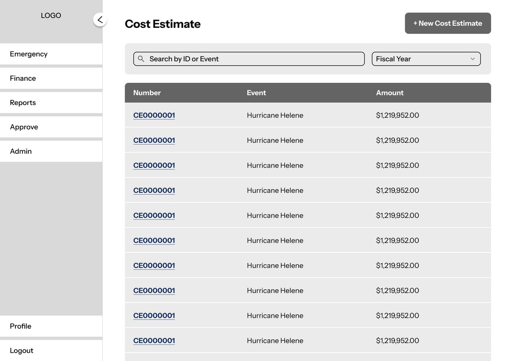
Wireframing
We made early sketches and wireframes to define core layouts and key workflows. We also explored multiple design directions for different interaction patterns and system structures.
Design System
We built a comprehensive design system from scratch in Figma with 85+ reusable components, including buttons, tables, navigation, and form elements, so that every screen across web and mobile inherited a shared visual language.

Mobile
The MVP was desktop-first, but field operators don't always have a desk. The mobile experience is scoped to fast, confident decisions: review queues, single-decision approval views, and quick status checks, without trying to compress every desktop flow into a phone.


TEST
—
We tested the prototype with 7 participants deliberately recruited across a spectrum, from seasoned InCEP users to first-time users with no financial planning background. Testing focused on 4 tasks that mirror the full approval chain: create a Mission Assignment, create a Cost Estimate, approve the estimate, and create and approve a Transaction.
Key Insights
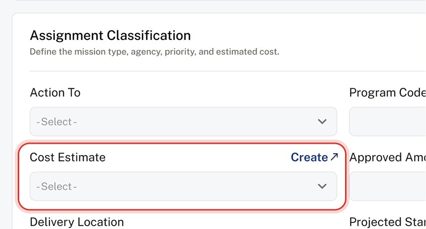
Discoverability & Clarity
Users struggled to understand key actions.
The “Create Cost Estimate” link is not obvious.
Terminology (CE, MA, funding lines) is confusing for new users.
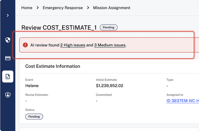
AI Visibility
AI features were valuable but often missed.
AI Review is not prominent.
Trust & Control
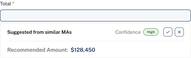
Users were unsure how much to trust AI outputs.
Confusion around confidence score & data source.
Users wanted to see the “why” behind confidence scores.
Outcomes
Increased Efficiency
~15 min → ~6 min to create a Mission Assignment. Document upload and extraction replace field-by-field transcription. AI Review before submission prevents errors.
Audit Readiness
Every state change attributable to a person and a timestamp.
Created, approved, edited, returned, visible inside the workflow.
Optimized Estimations
AI proposes an amount from comparable past missions and links to the source assignments, so the person signing off can check the comparison before accepting.
Reflection
This eight-month project with a real client, a real approval chain, and real constraints taught me more than any classroom project could. Here's what stayed with me:
Building a design system from scratch taught me that the system isn't the components, but the decisions baked into them. Every token, spacing rule, or state variant is a decision you make once, so you never have to make it again.
Designing for four users sharing one workflow is negotiation. Every screen had to serve the person using it without breaking the experience for the person who touches it next. The hardest design problems weren't visual; they were figuring out what the Approver needs to see that the Analyst didn't know to provide.
AI is easiest to design when you stop asking "where can we add AI?" and start asking "where is a human doing work a machine should handle?" That reframe eliminated half our ideas and sharpened the rest. The features we cut were more important than the ones we kept.